August Hill Architects, SEO Rewrite and Website Revamp
For visual design and local search (SEO), 2017
August Hill Architects specialized in custom residential and remodels, commercial, retail, and public projects in the Puget Sound area. The principal had over three decades of experience in collaborating with clients to create attractive, accessible, and welcoming spaces that reflect their history and surroundings while meeting modern codes and standards.
Alas, he passed away in 2020.
After wrapping up several demanding, years-long projects, my client realized he wasn’t getting any referrals through his website. I looked over it and saw he had some great assets. These included a strong portfolio, good quality photos, well-written descriptions of his approach and processes, and highly positive online reviews.
Yet, the August Hill site wasn’t mobile-friendly or optimized for local search so new clients could find them.
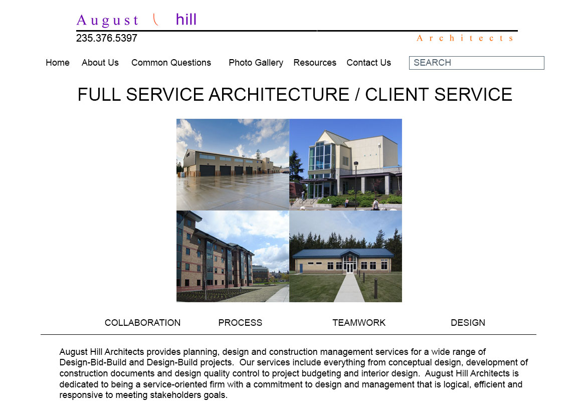
August Hill Architects Site Revamp
It clearly was time for a revamp. For the rewrite, I researched keywords that would help our site rank higher in local search, and also reviewed other architects’ sites. I then rewrote the site and optimized it for search.
As for the visual design… We explored other sites for inspiration. We then chose a WordPress theme with more updated features, and added photos from the Puget Sound area to create a more local look and feel. I then researched common search terms and edited content to give August Hill a better chance of appearing on the search engine results pages (SERPs).
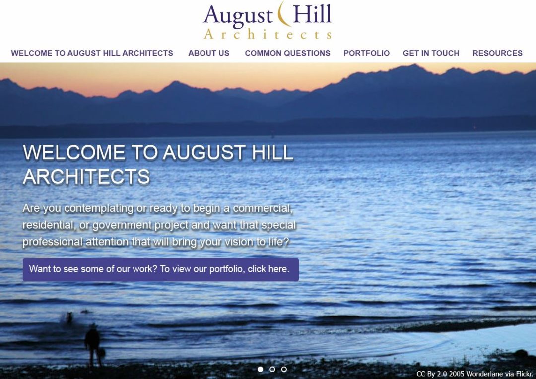
I also created a slider on the home page, and wrote copy with large buttons to help people learn more and fill out the contact form. The slide shown at the top of the page links visitors to the portfolio with work samples.
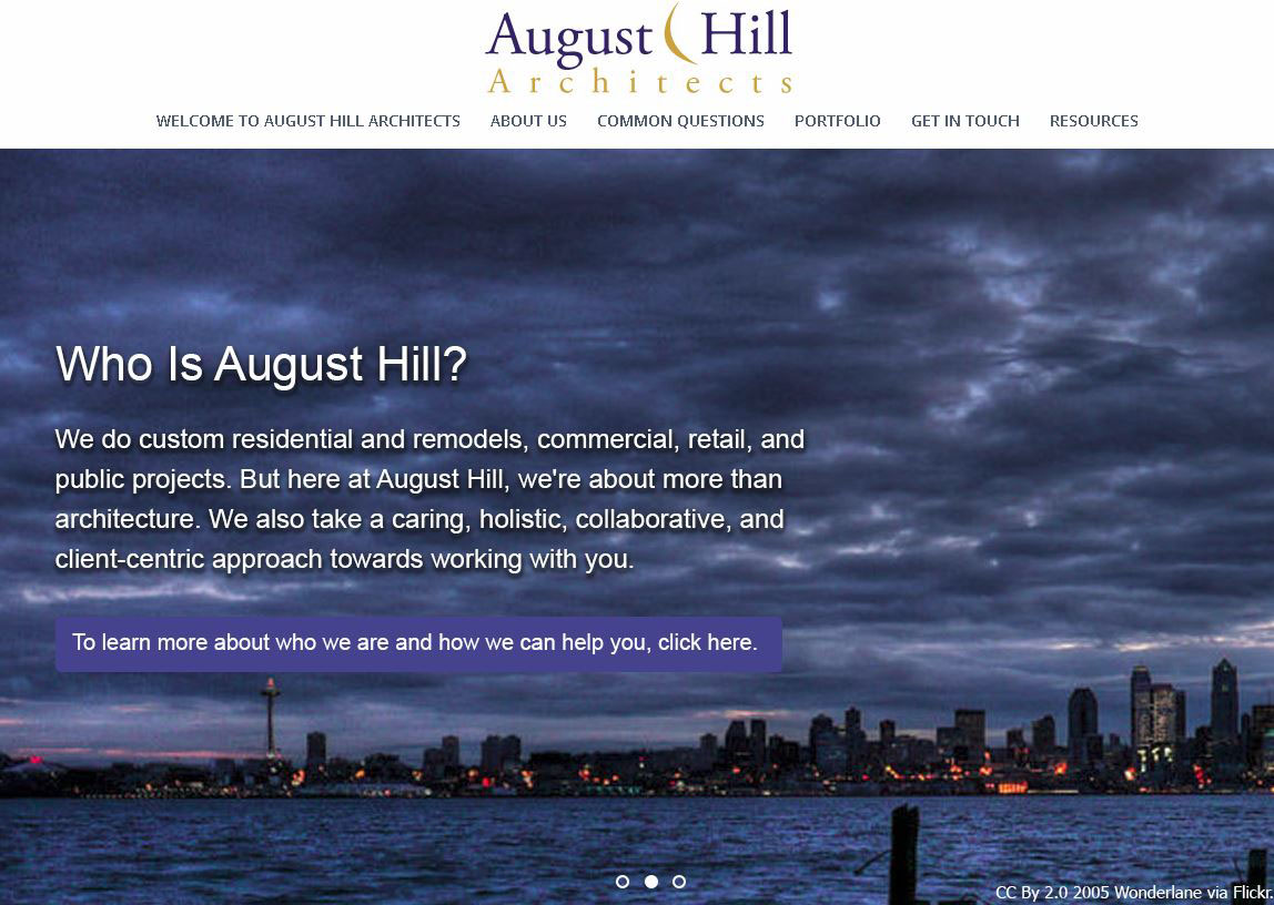
The home page slider shown below takes visitors to the About page.
The third home page slider takes visitors to the Contact Us page, where users fill out a form with their contact info and a brief description of their project.
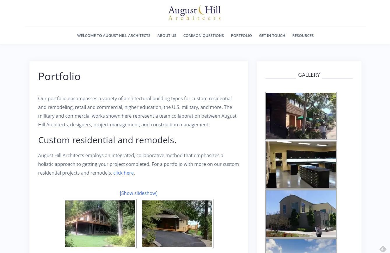
In addition, I organized the Portfolio page by project type and added a gallery widget for browsing photos of recent projects. Categories are as follows: Custom Residential and Remodels, Commercial and Retail, and Public Architecture.
I also made sure the August Hill Architects site would appear correctly and be readable on mobile.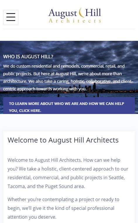
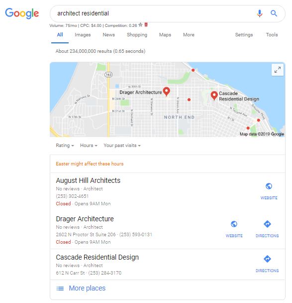
Although I don’t have hard numbers, the principal told me he’s gone from getting no referrals to getting more work than he can handle. This is likely because August Hill began appearing within the coveted top three box for Google’s local search within two weeks.
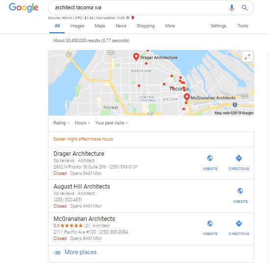
I also got him to rank first in Google’s local search for “residential architect,” another low competition keyword that gets 5,400 searches a month.
